| Table of Contents |
|---|
...
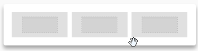
The Structure panel includes different types of structural elements for your message. Think of them of a way to create different sections of the message.
For example:
- A single column section at the top with a hero image
- A two-column section in the middle, with a recent product announcement
- A three-column section in the lower part of the email, with some product information
- Etc.
Unlike content blocks available in BEE v1, the new structures provide much more flexibility and customization at both the row and column level.
Also, you can now clone entire structures (for example, a picture, a button and a text) with all its settings and blocks. Previously you could only clone a single block of content.
...
- Content area width: set by default to 600px, which is the recommended width for most devices.
- Background color: it's the newsletter's background color. This setting is effective only for rows where a color has not been specified, inside "Row properties". Otherwise, the background color specified for that content structure will be used.
- Content area background color: it's the background color for all content areas. This setting is effective only for rows and columns where a color has not been specified.
- Default font: it's the font used for the whole newsletter. This setting affects all text set to use the default font.
- Link color: it's the link color. As above, this setting affects all text links set to use the default color.
Undo, redo & history
When designing, you can rewind and fast-forward to any point in your recent edit history. As soon as a change in the message is detected, a compact Undo widget displays in the bottom left corner of the editor.
The widget displays 3 items that correspond to these 3 actions:
- Undo & Redo arrows that offer the classic pattern to move back and forth between changes.
- A history icon that expands a timeline of the latest changes, as shown below.

Save and exit
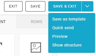
For each message, you create you can:
...